From bumper stickers to lighting up national buildings, the rainbow flag has been a symbol intended to acknowledge and signify justice and respect for the LGBTQ+ community. While used heavily commercially, the origins of the Pride flag are grounded in the ideas of change and progress. Since its first inception, there have been several versions, each with their own meaning.
This change matters, and it is important that we educate ourselves about what each iteration symbolizes to honor, celebrate, and welcome the progress being made. While this series focuses on flags representing the entire LGBTQ+ community, it’s important to note that there are many flags representing identities within the LGBTQ+ community.
It is also worth noting that symbolization of identity has not always been represented in flag form. Before the Pride flag originated, many LGBTQ+ people used a pink triangle for representation; this symbol, adapted from a badge worn by gay people in Nazi concentration camps, was later adapted by queer people and used by organizations like ACT-UP during the peak of the HIV/AIDS epidemic. According to the Los Angeles County Department of Mental Health, other symbols used by LGBTQ+ groups include “green carnations, purple handprints, Greek symbol lambda, blue feathers, and ace playing cards.”
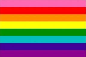
6-Color Flag
Our journey today starts with the rainbow flag. Many are familiar with the 6-color rainbow flag shown on the right. Lesser known, is this flag’s predecessor: the original version of the rainbow flag designed by Gilbert Baker and Lynn Segerblom (a.k.a. Faerie Argyle Rainbow) in response to an ask from Harvey Milk (San Francisco Board of Supervisors member and first openly gay man elected to public office) to create a symbol representing the “gay community”.
Baker & Segerblom’s Flag
The eight colors in Baker and Segerblom’s flag each hold meaning:
This flag made its debut at San Francisco’s Gay Freedom Day Parade in 1978. However, the hot pink and turquoise stripes from Baker and Segerblom’s flag were shortly removed due to difficulties in creating or dying the fabric, resulting in the 6-color rainbow flag many know today.
Rainbows have since been synonymous with the LGBTQ+ community for many years. They are seen in windows of supportive businesses and homes, on streets in queer neighborhoods, and in logos every June. Rainbows symbolize unity within the queer community, and they underscore support for LGBTQ+ people.
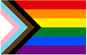
In 2017, a new iteration of the Pride flag featuring two additional stripes was introduced in Philadelphia. Designed by queer artist and activist Amber Hikes, the Philadelphia Pride flag was a response to the need for greater visibility and recognition of queer people of color.
The black and brown stripes were included to represent people of color within the LGBTQ+ community and acknowledge the intersectionality of different identities and experiences.
By incorporating these stripes, the flag serves as a reminder to uplift and center the voices and experiences of individuals from diverse racial backgrounds who have historically faced marginalization and discrimination within both the LGBTQ+ community and society at large.
The introduction of the Philadelphia Pride flag sparked important conversations about inclusivity and representation within the LGBTQ+ community. It highlighted the importance of recognizing and addressing issues of racial inequality and emphasized the need for solidarity and support among all members of the community.
Building upon the momentum of the addition of the black and brown stripes in 2018, a year later, designer Daniel Quasar added not only new colors, but new shapes to create the Progress Pride flag.
The chevron pointing to the right is designed to symbolize the direction of travel LGBTQ+ rights and forward movement and advancement for the community. Encompassed in the chevron therefore are the black and brown stripes which were previously added to represent racial diversity in the LGBTQ+ community and the newly added white, pink and light blue, the colors of the transgender flag to further progress inclusion of all identities.
By incorporating both new shapes and colors, the Progress Pride flag recognized the importance of intersectionality and inclusivity within the LGBTQ+ community. It also serves as a visual representation of the ongoing fight for equality, justice, and the recognition of diverse identities.
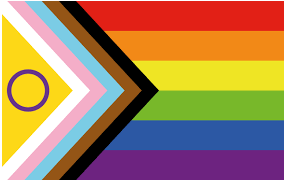
The evolution of the flag has continued, and most recently in 2021 Valentino Vecchietti designed a new iteration to include representation of intersex individuals and their experiences within the LGBTQ+ community. Intersex refers to individuals who are born with variations in sex characteristics that do not fit typical binary notions of male or female.
The Intersex-Inclusive Pride flag which incorporates a yellow triangle with a purple circle, colors often associated with intersex advocacy and visibility, was designed to recognize and celebrate intersex people, as well as support in raising awareness about their unique identities and the discrimination they face.
This flag aims to promote inclusivity, educate others about intersex issues, and foster a sense of belonging and acceptance within the LGBTQ+ community. Its existence is a testament to the ongoing evolution of Pride flags, demonstrating a commitment to recognizing and honoring diverse identities within the community.
As the understanding of gender and sexual identities continues to evolve, it is likely that Pride flags will continue to be adapted and expanded to represent the full spectrum of LGBTQ+ experiences. These flags serve as powerful symbols of visibility, solidarity, and progress, reminding us of the ongoing journey towards equality and acceptance for all.
At Capco, we appreciate that to truly create a sense of inclusion, it is important that we educate ourselves around important topics and the lived experiences of others. We are proud to share the latest Pride@Capco logo, which has evolved from the traditional 6-colour flag to the intersex-inclusive progress pride flag and we hope this series explains the journey behind this change and what each iteration represents.
Pride@Capco seeks to provide support for the entire LGBTQ+ community and direct programming based on the LGBTQ+ community’s current areas of focus. The logo change bolsters Pride@Capco’s vision for a work environment in which any LGBTQ+ colleague can feel seen, supported, and empowered to do their best work.
In addition to hosting programming to provide education, peer learning, and community for LGBTQ+ people and allies at Capco, Pride@Capco currently focuses on meeting new Human Rights Campaign Equality Index standards for corporate LGBTQ+ equality, enhancing support for transgender health benefits with Capco’s benefits package, and attending conferences for LGBTQ+ recruitment and corporate equality best practice.